Friday, 11 May 2012

"Bear Have You Been?"


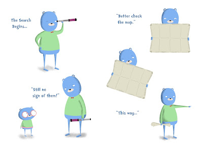
After much blogging around the subject of working on my 'Final Major Project', it occurs to me that I have yet to post any of the actual work itself. Well, now you can see for yourself what all the fuss has been about. It's taken me a while to get to this point. It has taken numerous character designs for the two main protagonists. Numerous background designs for the world in which they inhabit. It has taken a lot of experimenting with various styles to use for the book. I've tried using block print textures, charcoal, pencil, and crayon. I've tried creating it all digitally, then when that seemed too artificial tried the opposite only to find that a compromise between the two was the best way.

I think most people would agree that I spent too much time worrying over little insignificant details of the designs, like if both bears should be wearing glasses, or what colours their clothes should be, or if I should draw each individual hair. The list goes on, and I don't like to think about all the time I have spent worrying over how I should do the shading, or if there should even be shading, how dark should it be.

Its fair to say that some of this time could have been better served, perhaps on the animation, perhaps even on updating this blog more often. Either way the important thing for now is the work is done and I am pleased with it. For the most part that is. When I look at it I still see my mistakes and can't help but think of things I would like to have done differently. But then, I think most of my classmates feel the same way when looking at their 'Final Major Projects', we have to accept that we will never be totally satisfied, we just have to be content in the knowledge that we have done as well as we can.

So, here it is, see what you think:


Inspiration From Diverse Sources

Working on this 'Final Major Project' has lead me to realise that inspiration for illustrations can come from a diverse range of sources. As a first year I imagined that my inspiration should always come from within the illustration and design discipline. Now, however I realise that if you never take ideas from anywhere outside of the 'illustration bubble' then your work will lack originality. You should always be soaking up inspiration that can feed back into your illustrations.


I understand now why, at the beginning of this year, once a month our tutor would gather the class for a 'creative review'. This was a discussion where everyone came with a book, a film, and article from a publication and an exhibition to recommend to the rest of the class. At the time I really enjoyed these discussions, I enjoy any excuse to chat about books and movies. Now, I'm grateful to these sessions as they made me realise that all of the above forms of diverse culture can feed back into your work.


When it came time to decide on a brief for our  'Final Major Project', we were asked to use the Christmas break before starting as time to gather inspiration. One of my presents that Christmas was the book 'The Road' by Cormac McCarthy. A book as bleak as it beautiful, that tells the story of a father and son, trying to survive in a post-apocalyptic world. McCarthy describes terrifically the way that the father cares and worries for his son, who he will do anything to protect and the son who fears the large, dangerous and confusing landscape, and looks to his dad as his saviour. McCarthy sums up their love and dependency on each other perfectly when he writes that they are: 'each the others world entire'.


When I wrote my initial brief for my 'Final Major Project', I wanted to write and illustrate a children's book and I looked to 'The Road' book for inspiration. Although 'The Road' might seem like an odd place to take ideas for a book aimed at children, the core themes of the text seemed to me like ones that would suit children's literature. The themes of parent- child bonding seemed universal to me. The way that the child looks up to his dad, reminded me allot of my childhood years, where a parent can be your entire world.


So I came up with a story of two bears, a father and a son, lost in a forest, trying to find their friends. Like in 'The Road' my book is about parent-child bonding, about father and son against the world, working together to overcome adversity.


The book is now finished, I'm pleased with the illustrations I created for it and with themes those illustrations represent. These are themes that I found by looking to sources far outside 'the illustration bubble' for inspiration.


Thursday, 10 May 2012

Hopes, Fears and Opportunities (Part Two)

As I rapidly approach the end of my degree, now would seem a good time to reflect on how this 'Final Major Project' has gone. Now is also a good time to look forward to what comes after my increasingly limited time left as an illustration student, as I begin the journey into the world of freelance illustration.

At the end of 2011, when writing 'Hopes, fears and Opportunities (Part One)' I wrote of my fear of the 'Final Major Project'. I was afraid that I would write a brief that would turn out all too late not to be right for me. I feared that at this point in the course, I would look over what I had created and feel ashamed, embarrassed and gutted to have wasted the opportunity. Back then I was continuously haunted by the image of myself at the end of year show, surrounded by the brilliant work created in this module by my talented colleagues, and then looking to my own sorry offering and thinking: "Where did it all go wrong?"

As relentlessly pessimistic as this now sounds (and it really does) I don't think that I was alone in this fear. I think all creative types occasionally doubt their abilities. I'm sure that this is true for even the most talented of illustrators. And when your classmates produce work as original and beautiful as mine do, there are few that wouldn't fear their own work looking weak in comparison. In a way, this fear has helped me to improve my work. I've constantly been striving to create a better quality of work, because the quality of work amongst my colleagues is so high. Some would call this competitive, but I think of it more as a 'team spirit. We've been on a journey together, refining our skills for the last three years, and for me to produce work that doesn't meet the standard set by everyone else would feel like letting the team down.

Thankfully, some six months later, this fear of letting both myself and 'the team' down hasn't come true. I feel that I chose the brief that was right for me. I've wanted to write and illustrate a children's book for years now, and I feel that my personal 'style' has developed into one that suits children's illustration. If I had chosen an alternative, more 'grown up' and serious brief for my final module I wouldn't have been being true to myself.

I also feel that the project has been something of a success. I usually shy away from saying that I've produced work that I'm proud of. I suppose because of a lack of confidence and fear that others may not agree. But this time, at the end of this project, I actually do feel proud of the work I've produced. That is not to say that I think the work is perfect, or that there aren't millions of other, similar pieces done by more talented artists that have been executed better. But I do feel that the work I have produced is of a higher standard than the work I created previously and is of the highest standard that I am currently capable of. So for that reason I do judge the project to be a success, and for that reason I am pleased, relieved and proud.

Last year I wrote of how during the closing months of my degree I hoped to make the most of the time I had left with my tutors and colleagues; I wanted to soak up as much of the inspirational studio, atmosphere as I could while there was still time. As this remaining time becomes evermore scarce, I am pleased to say that feel I have made the most of it. I've spent a lot of time working in the studio, with my friends and tutors following the progress of my project and giving me help and advice every step of the way.

The fact that at the end of the project I feel pleased with my work, is all down to the support I have received during the previous months. Pretty much every element of my final piece would have been different had it not been for all the input I have received from the guys in the studio. No matter how hard I work on my own, there is still no replacement for the casual, regular advice that you receive from your mates, whilst you work together.

It is only really now that I am able to fully appreciate how important and influential this studio atmosphere has been and how my work has improved as a result. My fear now is that after university, when I can no longer rely on my friends and tutors for advice, that my work will suffer as a result.

My hope is that we all stay in touch, that we continue to keep each other informed of how our work is progressing and that we continue to offer each other hints, tips and advice on how we might improve.

A good way to do this could be through social media, through blogs and Twitter: Posting our work online and gaining feedback from each other. This is of course, no match for the studio atmosphere and I hope that we still regularly meet up and discuss work.

Another good solution to this could be through 'Draw North West', a monthly meet up for illustrators in the region that has been started recently and is proving to be a success. These meet ups could give us an ideal opportunity to stay in touch and to discuss work.

There are a few of us in fact, who enjoy working together and who find the feedback from each other helpful, that have talked of setting up a collective when we finish university. This would be an ideal way to stick together and to continue to support each other. And of course, to encourage each other to keep up the illustration work.

This brings me to my biggest fear, a fear that I had six months ago when I blogged of what was to come and a fear that still troubles me. This is the fear that I will not continue to utilize and progress with the skills I have learned during my degree once I finish university. The fear that all this work will have been in vain.

This is a fear that is often backed up by those in the industry, who talk of how few of their peers have gone on to pursue illustration post graduation: of how most of them spent three years learning skills that they will never use and learning of an industry that they will never be a part of. I so don't want this to happen to me. I have wanted to be an illustrator since I was thirteen and dreamed of illustrating children's books. Now at the age of twenty-two, after three years of studying the subject, my passion for it is as strong as ever. That's why I can't bear the thought that I might gradually give it up, that I would let all this enthusiasm slip away.

 This is why I need to stick by those who feel the same, to keep myself focused on developing my work. After all, university may be almost over, but as I begin to edge towards the world of the freelancer, I can see that the real work is only just beginning.

Wednesday, 9 May 2012

Beginnings in Animation

Above you will find a short animation I made as part of my 'Final Major Project'. The animation is based upon the children's book that I have been working on, on a double page spread that features the book's two lead characters caught in the rain.
Although I am pleased with the piece (I think the way that the characters looks to each other communicates their relationship in much the same way as the book) I still wish that I could have done what I, perhaps naively, hoped to do earlier, which was to animate the whole of the book. 
Looking back now, it seems obvious that with the time given for this project, just getting the book done would take up the majority of the time, and that with animation being such a long process, getting the entire book animated would have taken longer to make than the book itself.

My finished animation may seem only incidental therefore as it only lasts twelve seconds and only incorporates one double page spread. But working on it has rekindled the passion I had for animation when I was ten and would use my Dad's camera to create stop motion films with my 'action men'. As I began creating the above piece, I felt that same excitement about bringing characters to life as I did back then.

This has convinced me that although my time as at university may be drawing to a close, I should still experiment with animating my characters. I'm excited at the prospect of pursuing this new direction in my work further and am determined to make more animations in the coming months.

So, although the above piece is only short, the experience of making it is one that has rekindled a passion in me that I hope to continue as a graduate.

Moving On Into Moving Image

During the closing months of our degree we have been set the task of creating a short animation, with regular weekly tutorials to help with the progress. I was really excited when I heard about this, I'd enjoyed working on a collaborative animation with Sarah enormously. There is something magical about watching a character that you've created come to life, and now I was to get the chance to learn how bring them to life myself. 

Following our initial briefing for the animation project I spent a fair amount of time on Vimeo, staring in wonder at one beautiful animation after another. An early favorite of mine, one that I have played endlessly, is this 'Sherbert Christmas Card' from 2010 by the 'This Is It Collective':

 
There is so much to love about this video, for a start I love the character designs, which are a fine example of someone creating a range of characters that, although diverse, are all instantly recognizable as belonging to 'the same world' (this is something that I have been advised to work on). 
I also love the technique: each model had been painstakingly hand cut and hand painted, a feat even more admirable when you consider that some models look to only have been used for single frames (or at least through my still amateur eyes they do). There are some who would question going to such lengths to create something that could perhaps have been made easier and faster digitally (in a program like Maya maybe). But I would argue that the extra work is totally worth it, the piece has a certain beauty and charm that can only come something that has been crafted by hand, pause the video at any point and you are given a beautifully crafted masterpiece.
Another personal favorite of mine is 'The Man with the Beautiful Eyes', a collaboration between animator Jonathan Hodgson and illustrator Jonny Hannah based on a piece of writing by Charles Bukowski:


Again, there are many reasons why I love this animation, and again a large part of that comes down to the handmade quality of the piece. There is something charming about being able to see the craft behind a piece in the piece itself, by which I'm referring to the variety of textures that are present in the animation: the watercolour paper, the inks the paints. The whole thing looks literally like drawings come to life and as with the previous piece, every frame of he animation could be framed on the wall.

Is Illustration Still Relevant? Part Three

Across the river however, Shrigley has created something to appeal to a broad range of people, not just illustration geeks like me. As I mentioned in a previous blog post, I loved 'Brain Activity' and left the gallery smiling. The point being so did everyone else, everyone that wasn't associated with the illustration industry. The gallery was filled with a broad range of people all enjoying the artwork. These people may not have cared for the works aesthetic quality as much as I did (I really like Shrigley's style but am aware that it is one that can divide people) but they still enjoyed themselves. They enjoyed the exhibition because they enjoyed the message. Because Shrigley had something to say and that something was smart and witty.

The question now is how do we, those illustrators in training, keep the discipline that we love relevant in today's world. How do we stop the work we create only being appreciated by those within our circle? In my opinion the best answer is to follow Shrigley's advice and 'Fight the Nothingness!” We make sure that our work has ideas behind it; we make sure that we use the skills we have been honing during our training to communicate a message to a specific audience, one that doesn't end within the illustration circle.

For example, for my 'Final Major Project' I've been working on a children's book.  The message of my book is all about the father son relationship, and it s intended to be one that farther and their children will read through together, perhaps a bedtime story. The book is aimed at children. I do of course hope that my friends, colleges and tutors like it, and it would give me no greater pleasure for those in the illustration industry to think that it is of merit. But when I created the book I created it specifically for children to read, in the hope that they identify with the characters and enjoy the story.

To conclude what has become a lengthier point than planned: "Is Illustration Still Relevant?" Yes, but we can't take that for granted. We need to ensure that our work has an idea behind it, regardless of its aesthetic qualities and we need to ensure that the idea is one that those outside of the 'Illustration Circle' can appreciate. I'm aware that Zeegan's recent writing may have upset some of those within the circle, but the intentions behind the text are those worth taking notice of. It is only because he loves illustration that he worries for it so, and why he was inspired to write such a piece. It is up to us now, the illustrators in training about to put what we have learned into practice and heed Zeegan's warning. We must remember the message. We must remember the audience. We must fight the nothingness!

Is Illustration Still Relevant? Part Two


This article was written in September 2007, at the time all was well in the world of illustration and the future looked bright. What a difference five years can make. In February of this year, Laurence Zeegan, he who had written about the discipline with such enthusiasm and optimism some five years previously, wrote an article for Creative Review, entitled: 'Where is thecontent? Where is the comment?', about how in his opinion, the illustration industry has lost its spark and is in danger of becoming irrelevant. According to Zeegan:

"Illustration has become entrenched in navel-gazing and self-authorship."

Zeegan goes on to write of how illustrators have nothing to say anymore, they still create work that is aesthetically pleasing, but it is all merely an exercise in image making. Illustrators, according to the text, are no longer speaking to the public but to other illustrators and illustration students. This same culture of creating ones own opportunities as opposed to waiting for commissions, has lead to an industry that values means over message, where illustrators produce empty, shallow, if beautiful work, whose target market is others within the discipline.

As an example of this, Zeegan cites 'Pick Me Up', a graphic arts fair that ran at Somerset House in London. He wonders if the event, where illustrators display their work and sell prints and related ephemera, will appeal to anyone outside of the industry. When commenting on the work itself he writes:

"...what is there to be discovered? Are we offered much more than contemporary eye candy? Are we offered much more than mere nothingness?"

 This reasserts Zeegan's opinion that the illustrators of today have nothing say, and regardless of the merits by which they say it, they are still saying nothing. Hence his assertion that the discipline could be in danger of sliding towards irrelevance.

He then writes of 'Brain Activity' the David Shrigley exhibition, which he puts forward as an alternative to 'Pick Me Up': here is an illustrator with something to say. Shrigley's 'Fight the Nothingness' poster, displayed outside the Hayward Gallery would appear the encapsulate everything that Zeegan sees as being wrong with the industry.

As someone who visited both 'Pick Me Up' and 'Brain Activity' I can understand this point of view. Don't get me wrong, I loved 'Pick Me Up', I really loved it, I will definitely be going again next year and dream that one day my work might even be displayed there. I thought the work was fantastic, and many is the time that I've looked through the collection of postcards that I bought as a souvenir, and marvelled at just how beautiful the work really is. That's why I can't wait to return next year as I found the collection of work to be an endless source of inspiration.

However, some would argue that of course I would say that: I'm an illustration student, so it would come as no surprise that I found 'Pick Me Up' to be such a joy because the event was targeted at people like me. But what of people outside of the industry? What's in it for them?