Tuesday, 20 December 2011

The Benefits of Collaboration (Part Three)

I sent the illustrations of 'Jack' off to Sarah, thankfully she liked them, and so I set to work on the other elements.

The next thing I was to create was the door that Jack breaks through. I tried to keep my illustration close to the original door from the film in terms of colours and design. When it came to the illustration of the 'Feel Good' bottle I kept it as simple and bright as possible. I wanted the drink to stand out from its gloomy surroundings and I knew that it was important to clearly show the brand. I kept the design of the table this was to sit on even more simple. This was after all just a background piece and I didn't want it to distract attention away from what was happening.


Then came the design for 'Wendy'. I struggled slightly because she doesn't have the same stand out, instantly recognisable features that Jack has and so is not as easy to caricature. In the end when I came up with her final design I had 'Olive Oyl' from 'Popeye' in mind. I decided that I wouldn't concentrate so much on getting her to look close to the original character, as I had with Jack, but would instead concentrate on getting across her overall mood, which for the most part is scared.


It was an interesting change to create illustrations for animation. With each character that I created I was essentially creating a puppet. One that needed movable arms and legs, that needed to be able to blink and change expression, and most importantly one that needed to be easy to animate. I tried to fulfil this last point as best I could by keeping the characters various elements in clearly labelled and organised layers, which hopefully helped.


I really enjoyed illustrating for animation and would definitely like to do it again, there is something magical about watching your illustrations come to life. I would also love to collaborate with Sarah again, she has done a great job with the animation and the whole project has been fun from start to end.
I now realise why collaborations are such a good thing, its the bringing together of two peoples skills and ideas that creates something unique. I'm really pleased with how the animation turned out and really enjoyed helping to make it.


The Benefits of Collaboration (Part Two)

So, now that I had been provided with a storyboard and a list of the characters and elements that I was to create for this new and exciting brief, I set to work.

The first challenge was to create the character of 'Jack Torence'. I needed to create a character that would be instantly recognisable as the part that Jack Nicholson plays in 'The Shining', while at the same time keeping in mind that I needed this to be in the same cartoony and naive style that I have been using recently and because of which Sarah had asked me to collaborate.

To do this I started out with the basic head shape, eyes and nose that I have been using for previous projects as a template. To this I added some 'over the top' caricature eyebrows (an important point as Jack Nicholson has become known for his iconic eyebrows), an overly large toothy smile and some stubble (because when one is going insane, one doesn't have time to shave). The hardest part to get right was the hair, in the film Jack has a unique slightly eighties style that by the time of the 'axe scene' has started to unravel. To be honest, I'm still not sure if I got the hairstyle completely spot on. I was watching 'The Shining' recently (which I naturally counted as being 'home work') and couldn't help but become fixated on Jack's hair. Even when he was chasing his child through a maze with an axe I still found myself wondering 'did I get the fringe right?'. In reality, I don't think this point really makes much difference, it is the face that matters more to people and with the eyebrows, the stare and the smile I think I got that part about right.

Sarah required a side view of Jack for when he is breaking down the door and a front view for when he is delivering his famous line. Here's what I came up with:


The Benefits of Collaboration (Part One)

Over the last few weeks I've been working on a collaborative project with 'Moving Image' Student Sarah Brewster. She asked if I could create some illustrations that she could animate as part of her project. I jumped at the chance straight away as I have been wanting to do animation for a while now and this was the perfect opportunity.

She asked me to produce two characters and various elements that she could then animate into an advert. The advert she was making was a drink called 'Feel Good' and her concept was to create an advert as part of a campaign, a campaign in which iconic scenes from classic films are changed to include the drink 'Feel Good'. For this advert she had chosen the film 'The Shining' (1980) and the famous scene in which the insane Jack Torence chops down a door with an axe so that he might kill his wife, Wendy Torence. The scene has gone down as a classic and has been parodied by numerous people (including 'The Simpsons'), it is a scene that even if you haven't seen the film you will inevitably have seen it elsewhere, this is why it was such a good scene for Sarah to choose.


In the advert Sarah planned to recreate the part with Jack chopping down the door and saying the now oft-quoted phrase "Here's Johny" with Wendy screaming on the other side. In this version of the scene, however, Jack breaks through the door only to then walk past Wendy towards a bottle of 'Feel Good'. Once he has downed the the drink his mood changes from one of raging insanity to one of happy contentment. Thanks to 'Feel Good', Jack now feels good.

Sarah wanted me to re appropriate these characters in my style. It might seem like an odd choice to use my cartoony and naive style to recreate a scene from a horror film but that was part of the idea, it would make the scene funny from the start.

Once Sarah explained all of this me she gave me a brief and a storyboard, we agreed on a deadline and I set to work on what would turn out to be my favourite project of the year so far.

Monday, 19 December 2011

Graphic Gurus


At the end of my first year on the illustration course, I can remember going to the 'then third years' end of year show and being really impressed by the work of Chris Madden. I found it really inspiring and hoped that I would have of such quality when I reached third year. This is why I was so pleased when I was told that he was to be my 'Graphic Guru' for this year, because I admired his work so much. 

The 'Graphic Guru' programme was set up as a way of linking students in the third year with past students of the course who have gone on to become successful, the idea being that we can ask them questions regarding our work and future careers.

The first time I met Chris he mentioned how he had got his first commissions while still at university doing editorial pieces. He mentioned that this was a good way to start out, and it made me realise that I need to get some editorial work into my portfolio, which at the moment seems centred more around children's illustration.


He also mentioned that there are various publications that are good for showcasing your work to potential clients. He mentioned a submission based magazine called 'Ammo' that he recently had his work featured in, and recommended that we do the same; submission based publications are a great way to get you work out there.

The second time I met him was at the 'Draw North West' event. This was the first meeting of what has now become a regular meet up for illustrators in the north west, a meet up which Chris helped to organise. At the event I met a range of interesting,talented people working in the industry, all of whom spoke highly of Chris and his work: it made me proud to have him as my 'Graphic Guru'. The event was a resounding success and taught me the importance of networking and meeting other illustrators. As Chris pointed out, Illustration can often be a solitary career and the chance to meet up with others in the same profession is always useful.

I showed him some of my work at the event and he offered some helpful and constructive feedback. In the new year I'd like to show him my portfolio, get some tips for improving my work overall and for breaking into the industry.


Sunday, 18 December 2011

'Heroes' Update Four


A while ago the majority of my blogging consisted of updates for a project I was in the middle of for 'Music'. It only just occurred to me that the project has now ended and I haven't followed this up with a blog post.

Over the summer Ed and I would send Emails back and forth to each other, I would send designs and he would send feedback. Between us we eventually settled on a collection of 'Heroes' to use for the installation and came up with designs that we were both happy with. This was a really positive experience and it taught me a lot about the benefits of collaboration and gave me experience in working for clients and working with designers. The final designs were a big leap forward from those that I had initially submitted and I am very grateful to Ed for all his input, help and support.

The designs went up at the end of October and recently came down to make room for a Christmas piece. For the time that the 'Heroes' installation was up, I was really pleased with the results. After all the tests and all the changes, the final designs worked well to fulfill the original idea: the faces were recognizable, worked well together and people enjoyed using them to 'become their heroes'.

I would like to thank Ed and Craig for all their help and for choosing to use my idea even if the initial designs were somewhat rudimentary. I would also like to thank Dom for helping me to put up the installation, to return the favor I recently went in to help her put up her Christmas Installation which is looking great. The whole project was a really enjoyable learning experience. To see how the installation looked, check out this rather amazing website that Ed has been working on, the photos will be up soon.

Hopes, Fears and Opportunities (Part One)

To be honest I cant quite believe that I’m writing this; I still feel as though I have only just begun University and am now having to face up to the realization that soon I will no longer be a student and will have to make my way into the ‘real world’. It would seem so easy to ignore this, to bury my head in the sand and try not to think about the fact that I won’t be in education for much longer; but one of the things I admire about the course that I am now so rapidly approaching the end of, is that they don’t allow this. They want us to come to terms with this and to prepare us as best they can for life after graduation. That is why they have asked us all to write this piece about our final semester and life thereafter.

So, what are my hopes for the future? I suppose my biggest hope will to be pleased and satisfied with my work. This all sounds so simple, but as any art or design student will know all too well, it is often far easier to love the work of others than it is to be proud of your own. It usually takes me a long time to decide that a piece is complete and usually when it is I am relatively pleased with it, but then the next day or even the next hour I usually look back at it and see only the mistakes that I have made and can bring to mind only the changes I would like to make or how I would like to do it differently were I to do it again. It often takes a while, a few weeks usually, when I am removed enough from the project in question that I can better judge my work, and then I can see the piece’s merits in amongst all of these said mistakes. That is how I feel about my portfolio, I’m proud in retrospect of the work and ideas that lay behind it but still cannot help but think that I could do it all so much better were I to do it again. Perhaps this constant dissatisfaction with your own work is inevitable and in honesty it is probably healthy as it keeps you perpetually aiming forward towards creating better work. All I want at the end of the year is to able to look at the work in my portfolio and to like it all. Obviously I want other people to like it also: I want to create work that my colleagues, friends family and potential clients will enjoy; but as I am my own harshest critic I feel it is important that I like it and am proud of it.

As for my other more professional hopes: I would hope to get commissions from clients to create interesting and enjoyable work. What for that work will take and who those clients are, I’m not yet sure. The past year has taught me that the most satisfying and interesting work can be the most bizarre projects from the most unlikely of sources.

Now for the scary part: my fears. My biggest fear for the next semester is that I will choose a brief that will lead me in completely the wrong direction and will result in work that I don’t like. I worry that I may throw away this last great opportunity and create something that lets down all of the work I have created up to this point. I have this terrifying image of standing at my end of year degree show, looking with envy at the overwhelming collection of beautiful and sophisticated work created by my colleagues and looking at my own with a soul destroying feeling of guilt and disgust. I fear looking through my portfolio as a graduate and thinking: ‘is that it? Three years of blood, sweat and tears and that’s it?’.

My fear for after graduation is that the previous three years that I have spent in my most enjoyable and creative part of my educational life, will ultimately lead to nothing. I fear never getting the chance to utilise the skills that I have acquired during my time at university, of never receiving a single commission and of being condemned to an unfulfilling and disappointing working life.

Ultimately, I am the only person who can do anything to eradicate these fears and it is up to me to work hard through this last semester and thereafter to create the best work I can, to not give up and to keep on pushing forwards in the hope that it will ultimately lead to a working life as enjoyable and creative as time at university has been.

On a more positive note, this next semester is filled with exciting opportunities. For a start we are given plenty of time to create, complete and become immersed in our ‘Final Major Project’. Hopefully this will give me time to create work that I am truly happy with; to be given this much time to work on a self initiated project really is a fantastic opportunity to create the best work that I can. If I use this time wisely enough and make the most of the input from my tutors and colleagues I should hopefully end up with something positive.

I have been working recently with animator Sarah Brewster on a collaborative project whereby I provide illustrations for her to animate. This throws open another exciting opportunity. The project has been my favourite of the year so far and has led me to think about possibly pursuing illustration for animation in the future. Learning more about animation would also be useful in light of the way that the industry is evolving and illustration and animation seem to be merging (see previous post regarding ‘Illustrations Digital Future’).

The talk we had recently from Lord Whitney and my recent installation for Music has made me realize that the world is full of interesting and unexpected opportunities for illustrators if they are willing to look outside of their usual sources of work.

So to conclude, in my final semester I aim to make the most of the time I have left to produce the best work I can and leave with a portfolio that I can be proud of. After University I aim to look to beyond the usual sources of work to continue to refine the skills that I have learned over the past three years. In the meantime, for the time I have left in education I aim to make as best use of my tutors as I can to prepare me for what is to come. Finally I aim to appreciate and take advantage of working in a studio alongside my colleagues, who are some of the most intelligent, creative and inspirational people that I have ever met.

Friday, 16 December 2011

Illustrations Digital Future

“I know these are hard times for print journalists, I read that on the internet. One day you’re writing for the papers and the next day you’re sleeping under them.”

Malcolm Tucker
'The Thick of It'

Although this quote was originally directed at journalists, it speaks volumes about the concerns facing illustrators today. Editorial illustration is still the 'bread and butter' for most illustrators and yet the newspapers that commission them are seeing sales drop year after year as the truth becomes painfully evident that digital technologies are bringing print journalism closer to extinction. Why would anyone want to go out to buy an actual newspaper when they can find their news online? Many are blaming the 'Kindle' and the 'iPad' for allowing consumers to download the days paper from the comfort of their home and thus bringing printed news ever closer to irrelevance.

However, I would argue that those that despair over the deaths of both journalism and editorial illustration are somewhat missing the point. The public may be loosing its appetite for newspapers in their printed form but they haven't lost their appetite for newspapers all together. They may be able to find news online but the public still wants the verification and assurance that what they are reading is true and that only comes from trusted and reliable sources: like newspapers. The newspaper is not dead and neither is the editorial illustration, the home for both is now no longer at the news stand but on the IPad ,the Kindle, the SmartPhone or the Computer. 

The same can be said for book illustrations; the public still wants to read books and now they have the technology that can give them an entire library, full of books and full of illustrations at their fingertips.

There is still a market for editorial and book illustration, but illustrators have to realize that the format has changed and that their work is going to be viewed digitally. And with this change of format comes a range of exciting new possibilities. For example the illustration need no longer be a static, lifeless image, it can now be animated, it can now have sound, it can be interactive and can compliment its associated text in a whole new way. A good example of this is the Oliver Jeffers book 'Heart and Bottle', a children's book created for the iPad that was released to much acclaim last year. Jeffers tells a story using the standard practices of reading a book (for example page turning) and animation and the iPad's interactive potential has created a new and exciting way to children to engage with the text and the illustrations.

The new digital format may prove to be a blessing in disguise for some illustrators, after all now they need not worry about the print quality of their publications, thus allowing them to use a variety of textures and colours that may have otherwise been unsuitable. I am reminded of an interview with Cris Ware (at 3:25 in the video) during which he mentioned the difficulties he had in getting his book printed correctly. He mentioned how there had been certain editions where the colour combinations that he had so carefully chosen had not printed in the way he had intended and hence the entire mood of the piece was changed and the atmosphere he was trying to create was lost. Arguably he need not have had such concerns were the book published digitally.

So as illustration moves towards its digital future all hope is not lost, so long as illustrators can find creative and interesting ways to adapt to their work's new context.


Website Research

Over the summer I started to build my website. I suppose I had always seen the website as being something of an afterthought, a means of showing your portfolio to the world. I quickly discovered however that this is not the case, a poorly designed website will let down work of even the highest quality. There is an art to creating a website, as there is to any other form of design, and if I want to sell myself as a creative designer then I need to have a website with a creative design behind it.
In my opinion, a successful website for an illustrator (essentially an online portfolio with contact details) should be simple, professional, beautiful to look at and be easy to use. The idea is to give a potential client an overview of your work in a way that is interesting and represents your work well.

An example of a website that successfully achieves all of the above is the website of illustrator Gemma Correll. Her website opens with a charming start page that consists of a selection of her unique drawings and typography, each providing a link to various sections of the website (portfolio, blog, etc). I love this website design because every last detail of it its in her style, every page and every link has her personality and carries her 'voice'. I think that this is all important, because when constructing a website you want to sell yourself to a potential client as quickly as possible and with this website from the moment you enter you are entering this illustrators own quirky little 'world'. This is something that I need to incorporate into my own website, just having my work on the site isn't enough, every detail needs to carry with it a sense of my style to sell to a potential client. I could learn a lot from this example by Gemma Correll.

On the subject of making that first impression count, lets turn our attention to Chris Madden's website. Madden's website opens straight onto a page on which is his entire portfolio containing thirty pieces of work. Much like the website mentioned previously, when we enter this site we are entering a 'world' that is filled with the Madden style and voice. We get to know the artist instantly, right from the beginning. Gaining such an overview so quickly is no doubt just what a potential client is looking for and Madden's site does this perfectly.

As my website has been built on Cargo, it makes sense to look at sites using Cargo well. I very much like the way that Jack Teagle has set up his site, in a way that gives us an overview of the entire portfolio on the start page but also leaves room for plenty of white space so as not to feel cluttered. The same can be said for Alex Westgate's site, again we get all his work upfront but because he has stuck to a simple layout it is still easy to navigate.

My favourite website layout however has to be Malika Favre's site. The layout is simple, bold and confident; its all about using big, simple shapes and flat colours that coordinate well. It goes to show how effective a sophisticated use of minimalism can be, the website feels exciting and bursting with ideas and yet is easy to navigate. 

I could do well to learn from all of the above with my website, I want mine to be easy to use and yet bursting creativity and personality like these all have.


Wednesday, 14 December 2011

Portfolio visit: 'Taylor O'Brien'

I recently had a portfolio visit at 'Taylor O'brien', a design agency who specialize in brand inspiration. This was the first visit that I have organized over the phone, which perhaps doesn't sound like a big deal, but for me it felt like a step forward. There is after all something safe and removed in setting up meetings via Email, but whereas phoning up an agency may feel more intimidating at first, it is actually far more practical and straight forward. It also separates you from all those people who sent in an Email, only for it to go to the bottom of the pile.

I felt far more confident going for the visit itself, as it was the third time I'd gone into an agency to inquire about my work, I felt I had a better idea of what to expect. I had also taken the advice of Craig and Ed from my previous portfolio visit at 'Music' and made some changes to the layout of my portfolio and had bought along some of my 3D designs to give a better idea of the concept. These changes really paid off, when I was presenting my portfolio the overall flow seemed a lot smoother and the layout looked far more professional. Bringing along some 3D designs also went well; the designer who looked through my work seemed to appreciate being able to see how some of my designs worked 'off the page' and I think it made looking through my work more interesting.

I also got some helpful advice; the designer who I spoke to liked the printed texture of my work and thought the style may be suitable for editorial illustration, but questioned how quickly the use of such a technique would allow me to make changes to my work, should the client ask for it. He asked if I would rather work freelance or for an agency, I wasn't quite sure about the answer, in fact I'm still not entirely sure, but it made me realize that these are sort of questions that I need to be asking myself as I come to the end of my time at university. When he asked if I had a business card, I felt really unprofessional when I answered that I hadn't, but I suppose this is because I am still thinking of myself as a student, which I won't be for much longer.

That's one of the biggest things that I'll take away from my visit at 'Taylor O'Brien'; that I now need to think of myself as an illustrator, not a student.

'But isn't that your job?" (Part Two)

For the next match, Music commissioned illustrator '3D Glasses' (Chris White) to produce a poster that would portray the speed with which player Shaun Wright-Phillips moves around the pitch.
 
 Here's an example of '3D Glasses':


Craig mentioned how another illustrator had tried out the brief but hadn't hit upon quite what they were looking for. Then '3D Glasses' came along and created this:


 When it was time for City to take on Liverpool, it was Craig Bellamy that 'Music' wanted immortalized. They wanted to represent two sides of the player: the often negative public view of him, and his passionate, ferocious side that the fans admire him for. To achieve this they turned to the man often described as the 'Picasso of Gig Posters': Todd Slater.

Slater understood the 'Jekyll and Hyde' duality that the agency wanted to portray and created another successful poster for the campaign:

Craig commented that he could understand how Todd Slater had earned such a reputation: he got what they were after straight away.

Finally, it came time for the big one: the 'Manchester Derby' and the central figure in this showdown was Carlos Tevez, he was the one who had left United, joined City and got City fans very excited. Craig wanted to represent him as an icon for hope, and so turned to the famous 'Hope' poster designed by Shepard Fairey.


Craig wanted to create a poster that would do for Tevez what 'Hope' had done for Obama, he wanted to create a homage that showed Tevez as an icon carrying with him the fans hopes and dreams. And so in collaboration with Shepard Fairey, this is what was created:


This campaign for 'Manchester City' is just one of the projects that Craig told us about in what proved to be a very interesting, informative and entertaining talk. With each project that he went through he took us on a journey from the initial idea to the final piece. We all left with a greater understanding of the industry and what actions we can take to work within it.

Tuesday, 29 November 2011

'But isn't that your job?" (Part One)

Meeting Craig Oldham recently reminded me that I still haven't written a blog post about the talk he gave at college a few weeks ago. It was called 'But isn't that your job?' and was essentially Craig talking to us about his experiences of working with illustrators. He did this by taking us through a series of projects from beginning to end and talking honestly and openly about how he had found working with illustrators on each of these projects.

For example 'The Big Four'. This was a series of posters that were created to publicize football matches commissioned by 'Manchester City'. The aim was to create a buzz around each match. Craig had the idea that the posters should be designed like gig posters. The thinking behind this is that football on the scale that City play has more in common with a music gig than a traditional lower league game. A City game is now a major event not to be missed, like going to see a band at an arena. 

So, as something different for this project Craig decided to commision illustrators assosiated with the 'gig poster style' to create gig- esque posters for the games. The first was a City vs Arsenal game and the agency commissioned illustrator Michael Gillette (famed for his 'Bond' Covers for Penguin) to create a poster, using his unique style of typography and form, that would make player Emmanuel Adebayor look like a rock star.

Here's what he was famous for:


And here's the finished piece:


Craig talked us through the process of commissioning the artist, discussing what was needed, discussing changes to be made to drafts, discussing money and even discussing how often they were allowed to reproduce the image.


Wednesday, 23 November 2011

Portfolio visit: 'The Chase'

Last week I had a portfolio visit at 'The Chase' with Associate Director Lise Brian. Lise had came to college last year to give a talk about creating and presenting a portfolio and how to go about contacting agencies. I based much of the construction of my portfolio around that talk, so when it came to organizing portfolio visits 'The Chase' seemed perfect.

I'd never been to 'The Chase' before so I was really nervous (I tracked the place down about an hour before I went in for fear of getting lost or being late) but once I got there the people were friendly and welcoming and after a bit I felt completely at ease. It's an amazing place too, I was particularly impressed when I saw that an entire wall was covered with a giant 'Mona Lisa' and another which presented a quote that neatly sums up their design philosophy:

"There was once an old Indian craftsman who carved elephants from blocks of timber. When asked how he did it, he would reply, ‘I just cut away the wood that doesn't look like an elephant.’"

So, then I started to show Lise my work and talk her through my portfolio; I didn't have much experience of this so was worried that I might find myself unable to talk about my work properly. I think I did OK though; Lise seemed to like my portfolio, once I'd finished she called over a colleague to have a look through it too, which was encouraging. They both seemed to like the idea behind the 'Why Are Girls Always Right?' project and the 'Heroes' piece that I did for 'Music'. They also seemed to appreciate the booklet I gave them (even if it is was somewhat rudimentary) when I explained that the whole notion behind it had been inspired by their talk.

I left 'The Chase' that day feeling far more confident and positive than I had that morning. It was a useful, positive experience and one that I really enjoyed. Thank you to Lise Brian and cheers to 'The Chase'.

Portfolio visit: 'Music'

Yesterday I went for a portfolio visit at 'Music'. It helped that I had already been there a couple of times and met some of the people that work there, it meant that I felt far more relaxed about it than I would normally. When I got there I met up with Craig and Ed, I talked them through my portfolio and then they gave me their feedback. They were both very generous with their time, really helpful with their feedback and I feel that the experience has made me more confident about approaching people in the future.

While showing them my work I mentioned that I now find that my favorite part of the design process is coming up with the ideas. While Craig said this was a good way of thinking he also said that sometimes it looks as though I have come up with the idea and then rushed the piece itself. For example when I presented them my 'heroes' installation concept a few months ago they felt that the idea was strong but that the images needed a lot of work, hence over the summer I'd send work back and forth to Ed until I'd got it as they wanted it.

The same was a true of a booklet that I had created, they liked the images but felt that the piece was let down by the text which looked to have been rushed, and so this diverted attention from the illustrations themselves.

I also got some advice on improving my portfolio, like sticking to either landscape or portrait throughout to make it easier to look through and bringing along some of the 3D pieces that are shown to give people a better idea of what they look like and how they are made.They gave me some tips for improvement in terms of the order and layout to make it clearer and to make it flow better.

Encouragingly they both seemed to think that I have a style, which came as good news as I've been worrying about 'finding my style' for a while now. They both agreed though that the 'Heroes' project seems to be the only piece without that style: whereas the rest of my work has a more textured feel about it (a lot of it being printed) this project stands out for being minimalist and digital.

Overall, they seemed to like the work and the feedback was really helpful. It was a really positive experience, I now feel like I know what I need to do in order to improve my work and portfolio and feel more confident as a result. Cheers guys!


Monday, 21 November 2011

Lord Whitney

Yesterday we were fortunate enough to have a visit from Lord Whitney, a collaboration between two talented and inventive visual artists: Amy Lord and Rebekah Whitney. 


They both studied visual arts at university in Leeds, were both studying different disciplines- but were both missing something: One was a photography student who was struggling to find her niche and was beginning to discover 'documentary photography' wasn't really her thing after all and that she preferred photographing unusual hand made objects. The other was an illustration student who was starting to work three dimensionally but was unsure of where to go next. And then they started working together and it all clicked into place: they had a shared love for hand made objects and sets; a shared sense of surreal humor and a shared love of 'The Mighty Boosh'. When they started working together it all made sense. 


Unfortunately by the time they discovered this their time at university was coming to an end. However, the pair remained undeterred and once they finished their courses they continued to create work together with the same passion that they had at university. Only now without the studio space or the money. 


What then followed was months and years of hard work:finding commissions wherever they could get them, with little space and no money they worked on these projects with a sense of playful enthusiasm that has since become synonymous with 'Lord Whitney'. During much of this time they were holding down full time jobs but they still found time to create work together, often completely self initiated, creating simply for the joy of creating. And now that 'Lord Whitney' is a full time studio based business, that sense of playful creativity still remains. 


We were told all of this during a talk that they gave to us yesterday, a talk that inspired us and motivated us to remember to have fun whilst designing (even if we are now in third year). At the end of the lecture during the 'any questions' section that followed, I asked if they had any advice for us for what to do when we finished university. The answer was to: 'just keep creating'. To keep creating work that we enjoy and that inspires us. Good advice indeed.


Saturday, 19 November 2011

Two steps forward, one step back (Part Two)

However, in retrospect I think that a lot of that work was missing something. In much the same way that my first year work had the aesthetics but lacked the ideas I think that my second year work had the ideas but lacked the aesthetics. I would spend hours trying to stop my designs looking so generic, so cold, so digital. I wanted them to have warmth and a human quality but was struggling to do so.


I found myself in this position on this last project. I had ideas that I was pleased with (more of which later) and was interpreting them in what felt like an appropriate style. So far so good; except that the images were still lacking that certain something. For a while I was stuck, but then came the ‘Graphic Gurus’ event (again more of which later).

One of the ‘Graphic Gurus’ was a past graduate called Ben Jones, a successful and prolific illustrator who works mainly in print. And what amazing work it was too; looking at the beautiful and diverse images that Ben had created through printmaking reminded me of why I first fell in love with the process.


So, the next day I set to work creating the project through print, it felt great to get back to the hands on approach that I had been avoiding for so long, I realized how much I’d missed it. What made it all the better this time around was that I had established my ideas beforehand and the printing process had become a way to realize these ideas.

I think I found the right balance, between ideas and aesthetics. This time around I was using printmaking to bring to life my ideas in a way that feels all the more personal and honest. At the moment, this all feels like a step forward.

Wednesday, 2 November 2011

Two steps forward, one step back (Part One)


This last project has marked something of a turning point for me and my working method, it has been a turning point that I’d like to think has improved my work, but at the very least has certainly rekindled my excitement for creating images. I’ve returned to ‘print making’.


In my first week of first year I had a go at printmaking and it began an obsession that would go on to define the rest of the year for me. I became fascinated by it, it gave me a confidence that I had never felt with drawing and excited me far more than creating digital work ever had. It really felt like I had found my niche.


On reflection though, I think that this was something of a mixed blessing: on the one hand I was becoming far more out going and experimental with my work (trying everything from ‘linocuts’ to ‘collographs’ to ‘mono prints’ and ‘screen prints’) and was discovering a whole new range of diverse print based artists ( from Fans Masereel, to Helena Bochorakova-Dittrichova to Isabelle Vandenabeele). On the other hand I was becoming far too focused on the process and not enough on the ideas. With every new brief I would immediately start wondering how I could incorporate printmaking and the idea behind the images was coming second. As a result by the end of my first year I had ‘hit a wall’ with print making and now needed to focus far more on my ideas.

So in my second year, I pretty much stopped printmaking and made the majority of my work digitally. This meant that now it was the idea that came first and the working method that came second.

As a result I think that the work that I created in my second year was stronger from a ‘design theory’ perspective.
I was also becoming more interested in ‘style’ and was looking to modernist illustrators like Jim Flora and Charley Harper as well as contemporary practitioners like Jack Teagle, Ben Newman and  Stuart Kolakovic.

Tuesday, 19 July 2011

'Heroes' Update Three

So, after some further developing, here is a rough plan for the 'Heroes' Installation:


Thursday, 7 July 2011

'Heroes' Update Two

A few weeks ago I went for a meeting with the guys at 'Music' to discuss the 'Heroes' project. They asked me to simplify the designs and come up with eighteen faces. So, after the last few weeks I have been busy developing the original designs and coming up with new ones based on other musical icons with unique looks. Here's what I've come up with:


                                                                 Amy Whinehouse


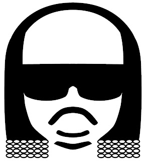
                                                                      Stevie Wonder


                                                              Slash (Guns 'n' Roses)


                                                                    Marilyn Mansson


                                                                 Michael Jackson


                                                                 Ozzy Osbourne
                                                              Paul Stanley (Kiss)


                                                                     Lady Gaga


                                                               Keith Flint (Prodidgy)


                                                                    Kanye West


                                                                    John Lennon


                                                                     Elvis Costello


                                                                       Elvis Presley

                                                             Freddie Mercury (Queen)


                                                               Gene Simmons (Kiss)


                                                                       Elton John


                                                          David Bowie


                                                                       Bono (U2)